COVID-19 Dashboard in Python using Streamlit

Software Engineer ∙ Blogging my learnings ∙ Piano Hobbyist
The Coronavirus outbreak has brought the whole world to a standstill. This presents to us an opportunity to do things that we have always wanted to but couldn’t just because of lack of time. With my interests in computers, I have always wanted to create something which is actually useful in real life and which can create an impact. So, during this lockdown period, as I am learning Data Analysis and Machine Learning, I thought of putting my skills to practice and develop a dashboard which can help create awareness among the people, help them understand the intensity of this pandemic and inspire them to stay at home and help the world come out of this miserable times.
In this blog, I’ll take you through the complete process that I have followed while creating the dashboard.
To have a look at the end result before jumping in the process, checkout the link here: COVID-19 Dashboard by Hetav Desai
Steps
Collect data. Use the data source that is reliable and frequently updated with latest numbers.
Process the data. Structure the data as required for the analysis.
Clean the data. Remove unnecessary, duplicate and outlier data. Basically any kind of data that has the potential to generate errors in analysis.
Analyse the data. Create meaningful visualisations out of the data.
Present interpretations of analysis in an easily readable and understandable manner.
Packages Used
Pandas — to analyse and manipulate data
NumPy — to work with arrays and perform basic mathematical operations
Plotly — to create visualisations
Streamlit — to add interactivity and present visualisations in dashboard format
import pandas as pd
import numpy as np
import plotly.graph_objects as go
import streamlit as st
Data Collection
I have used the dataset published by CSSE, John Hopkins University on their GIT repository which is regularly updated. Here’s the link.
The read_csv() function from pandas library is used to read .csv data into a data frame.
death_df = pd.read_csv('https://raw.githubusercontent.com/CSSEGISandData/COVID-19/master/csse_covid_19_data/csse_covid_19_time_series/time_series_covid19_deaths_global.csv')
confirmed_df = pd.read_csv('https://raw.githubusercontent.com/CSSEGISandData/COVID-19/master/csse_covid_19_data/csse_covid_19_time_series/time_series_covid19_confirmed_global.csv')
recovered_df = pd.read_csv('https://raw.githubusercontent.com/CSSEGISandData/COVID-19/master/csse_covid_19_data/csse_covid_19_time_series/time_series_covid19_recovered_global.csv')
country_df = pd.read_csv('https://raw.githubusercontent.com/CSSEGISandData/COVID-19/web-data/data/cases_country.csv')
delta_df = pd.read_csv('https://raw.githubusercontent.com/CSSEGISandData/COVID-19/web-data/data/cases_time.csv', parse_dates=['Last_Update'])
Let’s have a look at the structure of these data frames. confirmed_df.head() gives the following output.
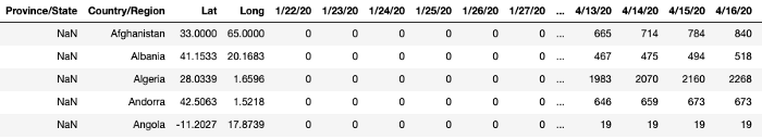
The data frame consists columns from 22nd Jan to current date. The structure of other three data frames is similar to this.
Data Processing and Cleaning
Let’s convert all the column names to lowercase as it makes it easy to access them. Also, we will convert Province/State to state and Country/Region to country for better accessibility.
country_df.columns = map(str.lower, country_df.columns)
confirmed_df.columns = map(str.lower, confirmed_df.columns)
death_df.columns = map(str.lower, death_df.columns)
recovered_df.columns = map(str.lower, recovered_df.columns)
delta_df.columns = map(str.lower, delta_df.columns)
confirmed_df = confirmed_df.rename(columns={'province/state': 'state', 'country/region': 'country', 'lat': 'lat', 'long': 'lon'})
recovered_df = recovered_df.rename(columns={'province/state': 'state', 'country/region': 'country'})
death_df = death_df.rename(columns={'province/state': 'state', 'country/region': 'country'})
country_df = country_df.rename(columns={'country_region': 'country'})
delta_df = delta_df.rename(columns={'last_update': 'date', 'country_region': 'country_name'})
Data Analysis
Now that we have a frequently updated data from a reliable source, converted to a format that easily accessible, let’s get into the analysis of this data.
Calculating total Confirmed, Death and Recovered Cases across the World
The country_df has columns for confirmed, death and recovered cases for each country. Taking the sum of respective cases for each country(i.e. sum of values in respective columns), gives us the total number of respective cases across the world.
confirmed_total = int(country_df['confirmed'].sum())
deaths_total = int(country_df['deaths'].sum())
recovered_total = int(country_df['recovered'].sum())
Calculating Current Day Increase/Decrease in Respective Cases
The sum of values in last column of confirmed_df, death_df and recovered_df gives us the total number of respective cases for current day.
confirmed_df[confirmed_df.columns[-1]].sum()
death_df[death_df.columns[-1]].sum()
recovered_df[recovered_df.columns[-1]].sum()
And, sum of values in second last column of confirmed_df, death_df and recovered_df gives us the total number of respective cases for previous day.
confirmed_df[confirmed_df.columns[-2]].sum()
death_df[death_df.columns[-2]].sum()
recovered_df[recovered_df.columns[-2]].sum()
Subtracting these two values for respective cases yields us current day increase or decrease in respective cases.
confirmed_today = int(confirmed_df[confirmed_df.columns[-1]].sum() - confirmed_df[confirmed_df.columns[-2]].sum())
death_today = int(death_df[death_df.columns[-1]].sum() - death_df[death_df.columns[-2]].sum())
recovered_today = int(recovered_df[recovered_df.columns[-1]].sum() - recovered_df[recovered_df.columns[-2]].sum())
Displaying a table of 20 Countries with Most Number of Cases
We will display Country Name, Last Updated Time, Confirmed Cases, Death Cases and Required Cases in the table. The country_df has the required data that is to be displayed in the table. Let’s extract the required data from it.
country_stats_df =
country_df[[‘country’, ‘last_update’,’confirmed’, ‘deaths’, ‘recovered’]].sort_values('confirmed', ascending=False)
             .reset_index(drop=True)
             .head(20)
This extracts the required columns from country_df, sorts the table in descending order of Confirmed Cases and returns top 20 rows into a new data frame called country_stats_df
Now that we have the exact data we need to display in the table, we will add some styling to it to make it more readable and easier to interpret. We will change the font colour for Death Cases column to Red and Recovered Cases column to Green.
def highlight_col(x):
  red = 'color: #e73631'
  black = 'color: #000'
  green = 'color: #70a82c'
  df1 = pd.DataFrame('', index=x.index, columns=x.columns)
  df1.iloc[:, 2] = black
  df1.iloc[:, 3] = red
  df1.iloc[:, 4] = green
  return df1
We pass a data frame x to the function and copy it to df1. The three colours are defined in the function. iloc function is used to select rows and columns in the dataframe. The first argument is for selection of rows and second for that of column. Using : as an argument suggests that all the rows/columns are to be selected.
In Above function assigns respective colours to all rows of columns with index 2, 3 and 4.
Let’s apply this styling to our data frame and pass it to st.table() function of Streamlit library, to display the table.
st.table(country_stats_df.style.apply(highlight_col, axis=None).set_properties(**{‘text-align’: ‘left’, ‘font-size’: ‘15px’}))
Creating Bar Chart Race for 10 Countries with Most Number of Cases
An online tool called Flourish Studio makes it really easy to create an Bar Chart Race. All we need to need to do is load a .csv file into the tool and select which column is to be used as Labels on Y-axis and which columns are to be used for values on X-axis. The piece of code below can be used to export the data into .csv file called latest_confirmed.csv as required by Flourish Studio.
latest_confirmed = confirmed_df.groupby(['Country/Region']).sum()
latest_confirmed.to_csv('latest_confirmed.csv')
Stats for a Specific Country
Creating a dropdown for Country selection
list_all_countries = list(confirmed_df[‘country’].unique()) creates a list of all the countries we have data for.
country_name = st.selectbox(‘’, list_all_countries, 71) is used to create dropdown. Any value selected from the dropdown is assigned to country_name.
st.selectbox() takes 3 arguments. A label for dropdown, list of values for dropdown and index of default value. I have passed 71 as default value index as it is index value for India.
Calculating total Confirmed, Death and Recovered Cases for Selected Country
First we create three new data frames from confirmed_df, death_df and recovered_df with only the data for specific country.
Then we calculate current day total, previous day total and their difference for current day change (exactly as done previously for World Data) for all three cases.
def show_country_stats(country):
    country_confirmed_df = confirmed_df[confirmed_df['country'] == country]
    country_death_df = death_df[death_df['country'] == country]
    country_recovered_df = recovered_df[recovered_df['country'] == country]

    country_confirmed = country_confirmed_df[country_confirmed_df.columns[-1]].sum()
    country_death = country_death_df[country_death_df.columns[-1]].sum()
    country_recovered = country_recovered_df[country_recovered_df.columns[-1]].sum()

    country_confirmed_today = int(country_confirmed_df[country_confirmed_df.columns[-1]].sum()) - int(country_confirmed_df[country_confirmed_df.columns[-2]].sum())
    country_death_today = int(country_death_df[country_death_df.columns[-1]].sum()) - int(country_death_df[country_death_df.columns[-2]].sum())
    country_recovered_today = int(country_recovered_df[country_recovered_df.columns[-1]].sum()) - int(country_recovered_df[country_recovered_df.columns[-2]].sum())
Plotting the trend for Confirmed, Death and Recovered Cases for selected Country
def plot_cases_of_a_country(country):
    labels = ['Confirmed', 'Deaths', 'Recovered']
    colors = ['black', 'red', 'green']
    mode_size = [8, 8, 8]
    line_size = [5, 5, 5]

    df_list = [confirmed_df, death_df, recovered_df]

    fig = go.Figure();

    for i, df in enumerate(df_list):
        x_data = np.array(list(df.iloc[:, 4:].columns))
        y_data = np.sum(np.asarray(df[df['country'] == country].iloc[:,4:]),axis = 0)

        fig.add_trace(go.Scatter(x=x_data, y=y_data, mode='lines+markers',
        name=labels[i],
        line=dict(color=colors[i], width=line_size[i]),
        connectgaps=True,
        text = "Total " + str(labels[i]) +": "+ str(y_data[-1])
        ));

    fig.update_layout(
        title="COVID 19 cases of " + country,
        xaxis_title='Date',
        yaxis_title='No. of Confirmed Cases',
        margin=dict(l=20, r=20, t=40, b=20),
        paper_bgcolor='#f5f5f5',
        plot_bgcolor='rgba(0,0,0,0)'
    );

    fig.update_yaxes(type="linear")
    return fig
We pass selected country as parameter in the function. Labels, colours, marker size and line size are defined for each case.
Labels for X-axis are Dates i.e the columns starting from index=4 and values for plotting on Y-axis are the sum of values in these columns for selected country.
As we have 3 data frames in df_list, the for loop runs for all 3 data frames, plotting graphs for respective case at the end of each iteration.
Plotting Daily Increase in number of Confirmed Cases for selected Country
We will use delta_df to plot the daily increase in number of Confirmed Cases.
We first extract the required columns from delta_df:
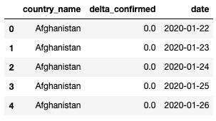
delta_df = delta_df[['Country_Region', 'Delta_Confirmed', 'Last_Update']]
The current structure of delta_df is as shown below:
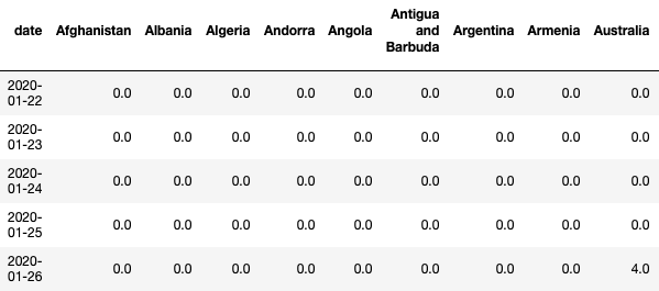
This structure is not at all useful to create any plot. We either need Date as columns and Date as index or vice versa. So, we will pivot the table as per our need. We will set Date as index and Country Names as columns.
delta_pivoted_df = delta_df.pivot_table(index='date', columns='country_name', values='delta_confirmed', aggfunc=np.sum)
delta_pivoted_df.reset_index(level=0, inplace=True)
After this restructuring of delta_df, it is changed as shown below:
We add a new column named ‘World’ which contains the sum of number of confirmed cases of all countries.
delta_world_df['World'] = delta_pivoted_df[delta_pivoted_df.columns].sum(axis=1)
Now we can use this data frame to plot a bar graph where the values in date column form X-axis and those in column of selected country form Y-axis.
def plot_new_cases_of_country(country):
    if(country == 'World' or country == 'world'):
        y_data = np.array(list(delta_world_df[country]))
    elif(country == 'US'):
        y_list = list(delta_pivoted_df[country])
        y_list = [x / 2 for x in y_list]
        y_data = np.array(y_list)
    else:
        y_data = np.array(list(delta_pivoted_df[country]))
    x_data = np.array(list(delta_df['date']))
    fig = go.Figure()
    fig.add_trace(go.Bar(
        x=x_data,
        y=y_data,
        name='Daily Increase',
        marker_color='crimson',
        hovertemplate='Date: %{x}; \n  New Cases: %{y}',
    ))
    fig.update_layout(
            title="Daily increase in cases of " + country,
            xaxis_title='Date',
            yaxis_title='No. of New Cases',
            margin=dict(l=20, r=20, t=40, b=20),
            paper_bgcolor='#F6F6F7',
            plot_bgcolor='rgba(0,0,0,0)',
    );
    fig.update_yaxes(type="linear")
    return fig
Conclusion
To keep it simple and easy to understand, I have kept my focus on Data Science aspect of the project. The designing part which uses HTML and CSS (Bootstrap) is not discussed in this blog. You can checkout the source code, here.
Thank you very much for reading this article and if you found it useful, please do share it with your friends or anyone who may benefit from this.
If you have any questions or want to discuss ideas, please feel free to reach out to me through your preferred medium of communication.